
Creating a Poster or Flyer
While there’s no one-size-fits-all method to poster design, there are some pitfalls to avoid and guidelines to follow which will help you to create an effective poster or flyer. Here are some tips and common mistakes to keep in mind for your next event poster.
LEARNING ZONEFEATURED
Poster Content
This is very important
Make sure your poster displays all the needed information by using the 5 W’s and 1 H checklist: Who, What, Why, Where, When and How. Amongst these, What, Where, and When are crucial
Who: Clearly state who is organising the event. If there are any sponsors involved, make sure to mention them as well. This information helps attendees know who is behind the event and can add credibility.
What: Clearly identify what the event is. Use a large, bold title to make this stand out at a glance. Highlight any unique aspects that make the event special or different from others.
Why: Explain the purpose of the event and why it matters. Whether the event is for fundraising, building community, raising awareness for a cause, or any other reason, make it clear to potential attendees why they should care and get involved.
Where: Provide precise location details so attendees know exactly where to go. Include the venue name and full address. For extra clarity, consider using What3words navigation - simply add three identifying words (such as ///always.stunt.spot) to pinpoint the venue location accurately.
When: State the date and time of the event in a way that is unmistakably clear, using a large font with strong contrast against the background. Always double check that the date and day of the week are correct to avoid confusion.
How: Give clear instructions on how to get a ticket, how to book a place, or how to make contact. This might include a website link, a QR code, or contact information. This is the call to action.
I have encountered quite a few posters and flyers that omitted at least one of these key details - for example, a restaurant flyer with no restaurant address (Where), event posters missing dates or times (When), or promotional materials not specifying the nature of an event (What). Another common fault is to have the correct day of the week but the wrong date, or vice versa, which is very confusing.
Effective Visual Flow and Design
There has been considerable research into what makes a poster layout effective, with areas of study including Gestalt principles, colour psychology, and a range of other design concepts. These theories offer valuable insights into how to create well laid out visually appealing and impactful posters. However, due to space constraints, a detailed discussion of these topics is beyond the scope of this article. Instead, the focus here will remain on a straightforward approach to a basic poster layout. For those interested in delving deeper, further research is recommended, it’s a fascinating subject.
Typically, when a viewer encounters a poster, their attention is drawn to the top third of the layout. Their eyes naturally scan from left to right across this top section before moving diagonally down from the top right corner to the bottom left, and finally across to the bottom right. Understanding this visual pattern helps when organising information so that key details are noticed quickly. A good graphic artist can disrupt this and create their own visual pathways but as I said earlier, I’m going to keep it simple.
Placing your event’s headline or title (WHAT) prominently on the top third of the poster section enhances visibility and ensures it captures immediate attention. You should use a big bold and possibly decorative font with good contrast to the background. However, if you do choose a decorative font make sure it is a legible one.
When visually scanning a poster, people look for distinct blocks of information such as the date and time (WHEN), the venue and address (WHERE), and other key elements. For maximum clarity, it’s best to keep the 5 W’s and 1 H spaced apart, presenting each in its own separate information block. The space between the blocks is as important as the blocks themselves. This arrangement makes it easier to quickly discover the essential details of the event.
Font sizes should accentuate the importance of each block of information. WHAT is the most important and should be the biggest you can make it, WHEN should be big and bold but much smaller than the header, next comes WHERE a bit smaller but still prominent, then WHY and WHO which can be kept to a regular font size not taking up too much space.
HOW: The call to action about tickets and booking can be placed near the bottom of the poster and while the rest of the poster should follow a uniform design pattern of fonts and colour, this can be made to stand out by breaking the pattern with a fresh font, colour or background. This will make it stand out but not overpower the main items.
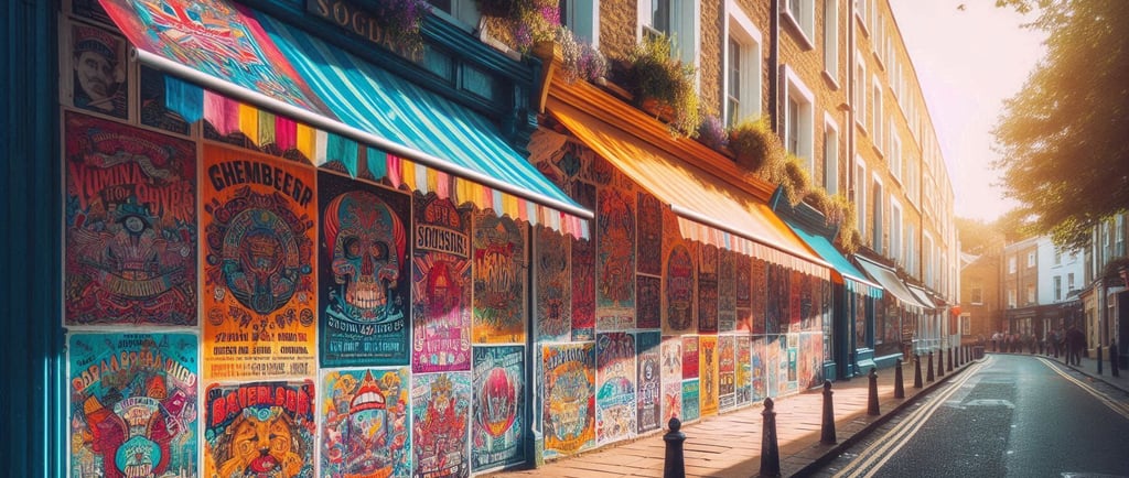
Images
Images can really add to your poster’s appearance, but you need to make sure they are relevant. They should give an idea of what to expect at your event and offer a promise of what’s to come. For instance, if you are organising a cheese and wine evening, a photo or drawing of cheese and wine or of people enjoying wine will work well. The main image in itself should be able to convey the gist of the event without any text.
You can use images in different ways. Use as a faded poster background under the text, as a vibrant strip up one side of the poster, or something more integrated into the text area.
Copyright Considerations for Artwork and Images
Photographs, illustrations, graphics, and digital artwork are automatically protected by copyright from the moment they are created. The copyright for an image belongs to its creator. Some creators choose to allow free use of their work by placing it in the public domain or releasing it under a Creative Commons licence. Others make their work available through stock image websites, where users must pay a fee to use the images.
It is crucial to ensure that you have obtained the necessary permission or licence before using someone else’s artwork. Failing to do so could result in prosecution for copyright infringement. A reliable source of Creative Commons licensed artwork is Wikimedia https://commons.wikimedia.org/, while Shutterstock https://www.shutterstock.com/ serves as an example of a stock image website where images are available for purchase.
Final Tips for poster creation
Don’t use too many colours. Try to stick to no more than three colours.
Don’t use more than two or possibly three typefaces instead use font variations such as bold, light, italic, and size.
Do not write everything in capital letters.
Make sure any photo or clipart you use is relevant to your event.
For commercial printing, your artwork needs a resolution of 300 dpi to avoid blurring.
Avoid clutter. If the poster looks cluttered, try taking things out or reducing the sizes of different elements to gain whitespace.
To comply with copyright laws, when using other people’s clipart or photographs make sure you have permission or have paid any fee that may be due.
Home - About - Contact - Submit a story - Terms & Conditions - Privacy policy - Archive
© Al Best 2026